
Rachel Fishman
Director, Higher Education


In an effort to help students and families find trusted data on college outcomes, the U.S. Department of Education recently released the College Scorecard, a consumer information resource that aims to help students and families compare colleges and universities. This interactive, web-based scorecardŌĆöaccessed online at╠²ŌĆöallows students and families to see five key data points about a college: costs, graduation rate, loan default rate, average amount borrowed, and employment. This past February,╠²╠²teamed up with╠²╠²to offer a Challenge that would improve the clarity of college information used in the DepartmentŌĆÖs ŌĆ£College Scorecard.ŌĆØ Yesterday, Lumina Foundation╠²╠²as one of the ChallengeŌĆÖs winners.
╣·▓·╩ėŲĄ decided to undertake this challenge and provide feedback and mock-ups of what a Scorecard 2.0 could look like. In order to improve the clarity of college information using the College Scorecard, we recommended redesigning it in the following ways:
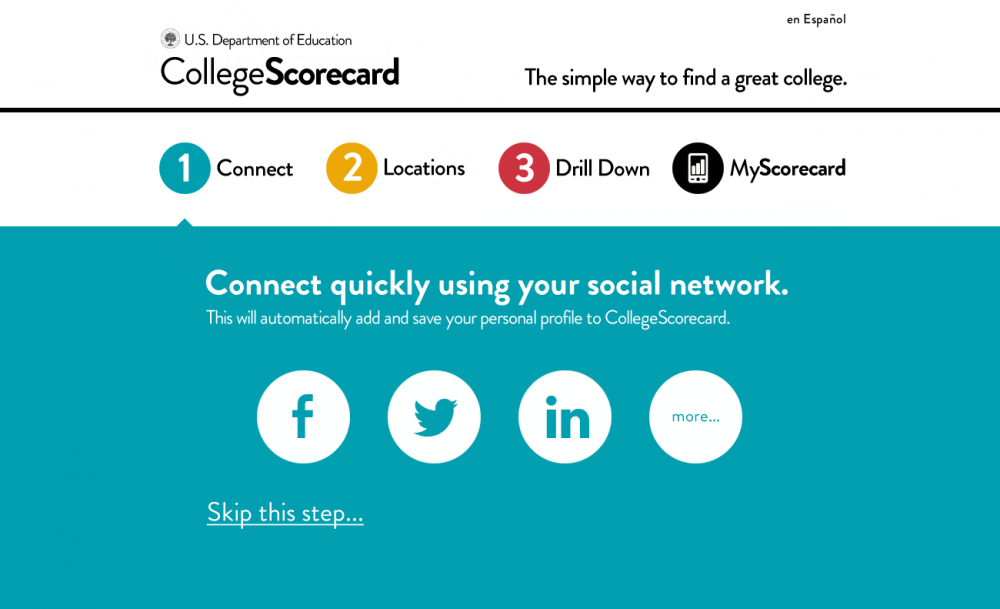
1) Simplified homepage with clear branding and easy search functionality.╠²Our Scorecard 2.0 introduces a clear-cut, three-step search process mostly based on location that will get students and families to their results faster. It also introduces a simple brand and tagline for the Scorecard.
2) Ability to tailor Scorecard based on student demographics.╠²In order to help resolve making the Scorecard both one-size-fits-all╠²and╠²customizable, we have created one default version of the Scorecard that is easy to print out. But within the Scorecard weŌĆÖve added several customizable elements that allow students to understand how, for example, costs change depending on their familyŌĆÖs income.
We offer a general overview and mock-ups of our Challenge entry below:
We propose that the U.S. Department of Education dramatically redesign the homepage for the Scorecard, simplifying its design and branding it so that students understand what it is. We also propose that the Scorecard have the capability to be translated into many different languages. Like Federal Student Aid’s website,╠², our Scorecard would have capability to be translated into Spanish, with other languages added. The point of the search page is to ask a minimum amount of questions that will aggregate a list of colleges for very different users. In three relatively quick steps, the user will have a short list of relevant colleges to explore more in depth.
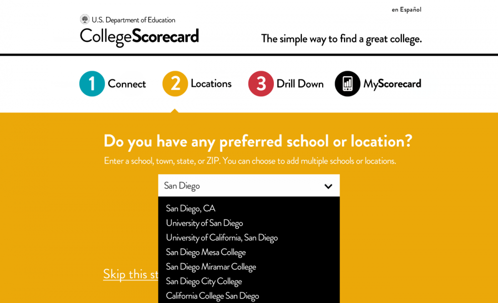
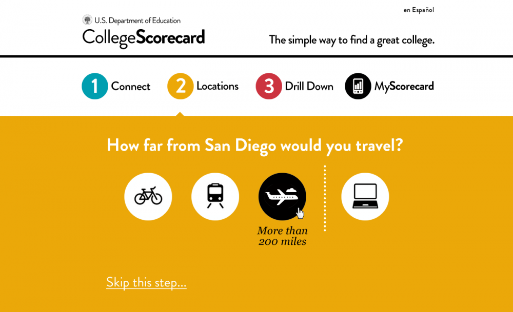
Once a student decides whether to log in via social media, step two asks, ŌĆ£Do you have any preferred school or location?ŌĆØ Since most students are location bound, this should be the very first question that is asked. ╠²If a user has a specific school in mind, they can enter that school and access its Scorecard right away. For example, if Andrea, a first-generation student, wanted to stick close to home, she could enter her hometown of San Diego and a list would begin aggregating where she could click on either a school or a metro area and how far sheŌĆÖd be willing to travel for school.
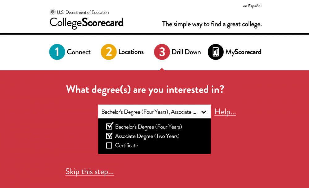
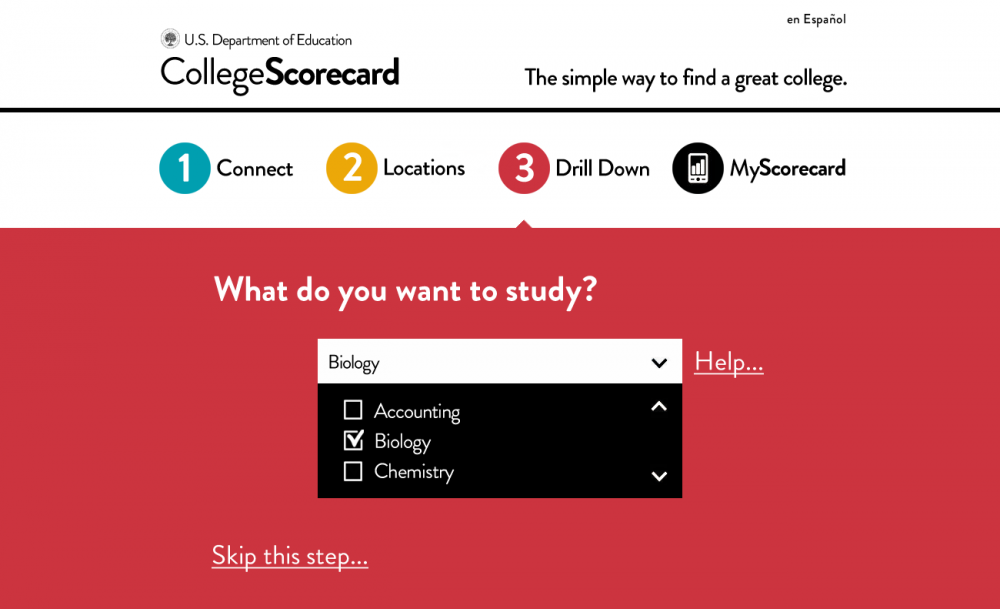
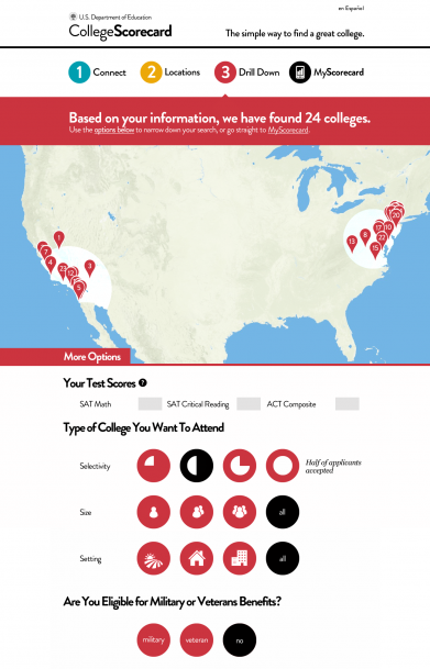
After Andrea chooses a location and how far she is willing to travel, she moves on to step 3 where she can indicate what degree type she is interested in and what she’s interested in studying. Since the current Scorecard is geared toward undergraduates and the peer groups are formed by primary undergraduate degree awarded, we limit a student’s options for degree types to certificates, associate’s degrees, and bachelor’s degrees. If students don’t know the differences between the degree types, they are able to click “Help” to the right of the box. They can also select multiple options. Andrea would also be able to narrow her options further depending on a variety of factors such as selectivity and size of institution.
Once a user has drilled down, he or she can view ŌĆ£MyScorecard.ŌĆØ MyScorecard gives users the data that the Department of Education would like students and families to see about higher education, in a clear and concise manner with plain language definitions. MyScorecard includes hover-over question marks that define terms like ŌĆ£Cost of AttendanceŌĆØ and ŌĆ£Net Price.ŌĆØ AndreaŌĆÖs results include San Diego State University and like the original College Scorecard, when Andrea looks at SDSUŌĆÖs data, she will learn its location, undergraduate enrollment, and type of institution. MyScorecard also features much of the same data as seen on the original version of the Scorecard:
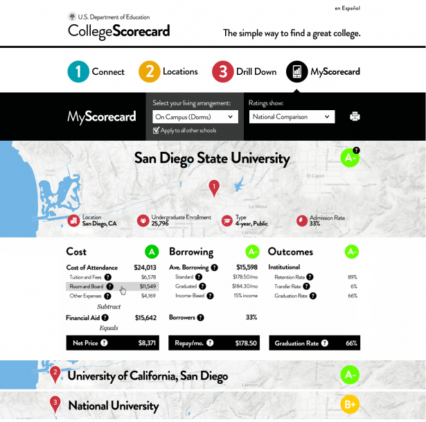
╠²In the cost section of MyScorecard, the concept of Cost of Attendance is introduced. Cost of Attendance is the budget that all financial aid is based upon, so it is an important concept to define early on in the college search process. Here the user can see the exact components of Cost of Attendance. They are able to choose their living arrangement to help personalize this section of the Scorecard. There are four options to choose fromŌĆöOn campus, off campus, off campus with family, and ŌĆ£IŌĆÖve already budgeted for housing.ŌĆØ Giving students the flexibility to choose their living arrangement will help give them an idea of a more realistic Cost of Attendance.
The cost section also introduces the concept of Net PriceŌĆöthe price a student pays after taking into account financial aid. If a student chooses any option besides on campus housing, net price grays out since average net price in IPEDs is only based off of the Cost of Attendance budget for first-time, full-time enrolled students. A window would pop up explaining to the student why the average net price might not be a good estimate for their needs and instead would lead them to the institutionŌĆÖs Net Price Calculator, which is a customizable tool that each Title IV institution must have on their website.
╠²Like the current Scorecard, MyScorecard features borrowing information. Here weŌĆÖve chosen to include median loan amount and percent of students borrowing federal loans. By including the percent of students borrowing federal loans, users will have context for the median borrowing numbers. Also included are three repayment plan options: Standard; Graduated; and Income-Based Repayment. A user would be able to enter in his or her estimated salary to see how Income-Based Repayment works. Unlike the current Scorecard, weŌĆÖve removed Cohort Default RateŌĆöa difficult to understand concept. Instead, any school with a Cohort Default Rate above 30 percent, a level in which the school would face sanctions from the Education Department, would not be listed on the Scorecard.
╠²Graduation rates donŌĆÖt give a full picture of an institution, especially for those institutions like community colleges that transfer many students. WeŌĆÖve included retention rate and transfer rate as additional outcomes measures to help students understand the overall health of the institution. While the current Scorecard has a placeholder for employment outcomes, here we have yet to include employment outcomes so as not to be misleading. As soon as the data exist, they would be added here.
╠²Recently, President Obama announced that the Department of Education would begin rating colleges and universities. Therefore, MyScorecard allows for the new Department of Education rating system to be incorporated and sorts institutions depending on their rating. Since the rating system hasnŌĆÖt been created yet, we are using letter grades as the example placeholder.
MyScorecard is meant to improve the user experience of the Education DepartmentŌĆÖs College Scorecard. While it includes similar data as the current Scorecard, it enhances the search functionality to work for both traditional and nontraditional students alike. The opportunities to tailor information throughout MyScorecard help ensure that it is reflective of all kinds of situations and is adaptable to meet the needs of a diverse student population.”
Director, Higher Education